This & That - Brand Identity & Packaging
This & That - Brand Identity & Packaging
This & That - Brand Identity & Packaging
This & That - Brand Identity & Packaging

project overview
This & That is a South Australian wine seltzer brand that approached me to create the visual identity from the ground up. From the start, the brief was clear. It needed to be fun, unexpected, and confidently different, with a strong focus on not feeling like just another seltzer on the shelf.


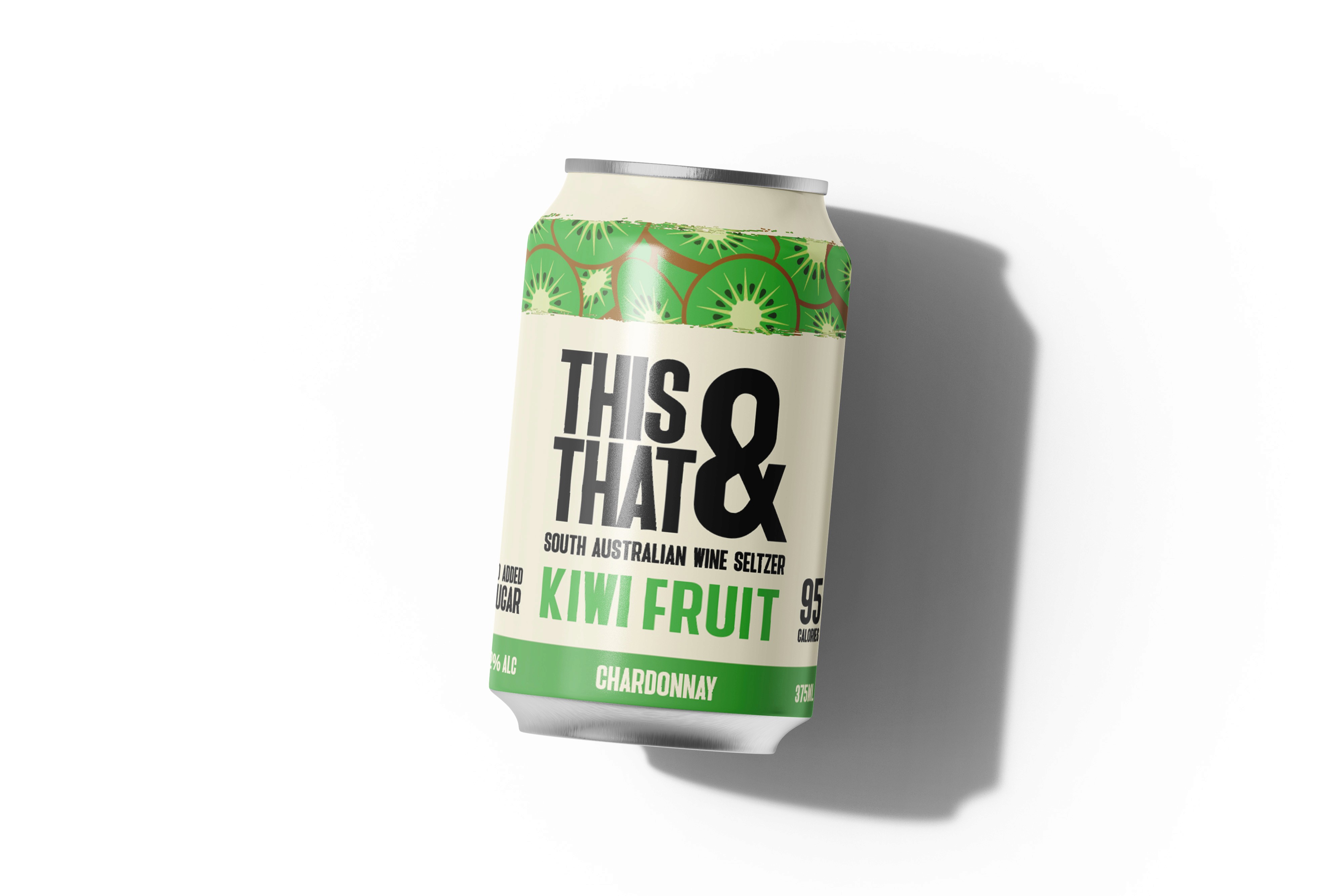
Although the product is technically a wine seltzer, the brand wanted to sit as far away as possible from the traditional, polished wine aesthetic. The goal was to avoid anything that felt snobby or serious, and instead create something playful, approachable, and bold.
The final can design reflects this direction, using colour, typography, and illustration to build a distinct personality that stands out while still feeling cohesive as a range. The brand launched with two flavours, watermelon and passionfruit, and has since expanded to include kiwi fruit, with more flavours planned.
This was a genuinely enjoyable project to work on, and one where I had a lot of creative freedom. Seeing the brand grow beyond its initial launch has been incredibly rewarding.
other projects
FOX NUTS - Brand Identity & Packaging
Brand Identity & Packaging
FOX NUTS - Brand Identity & Packaging
Brand Identity & Packaging
FOX NUTS - Brand Identity & Packaging
Brand Identity & Packaging
FOX NUTS - Brand Identity & Packaging
Brand Identity & Packaging
FOX NUTS - Brand Identity & Packaging
Brand Identity & Packaging

STEDI Australia - Digital Campaigns
Digital Campaigns
STEDI Australia - Digital Campaigns
Digital Campaigns
STEDI Australia - Digital Campaigns
Digital Campaigns
STEDI Australia - Digital Campaigns
Digital Campaigns
STEDI Australia - Digital Campaigns
Digital Campaigns

RUNVA Australia - Product & Packaging Design
Product & Packaging Design
RUNVA Australia - Product & Packaging Design
Product & Packaging Design
RUNVA Australia - Product & Packaging Design
Product & Packaging Design
RUNVA Australia - Product & Packaging Design
Product & Packaging Design
RUNVA Australia - Product & Packaging Design
Product & Packaging Design