FOX NUTS - Brand Identity & Packaging
FOX NUTS - Brand Identity & Packaging
FOX NUTS - Brand Identity & Packaging
FOX NUTS - Brand Identity & Packaging
project overview
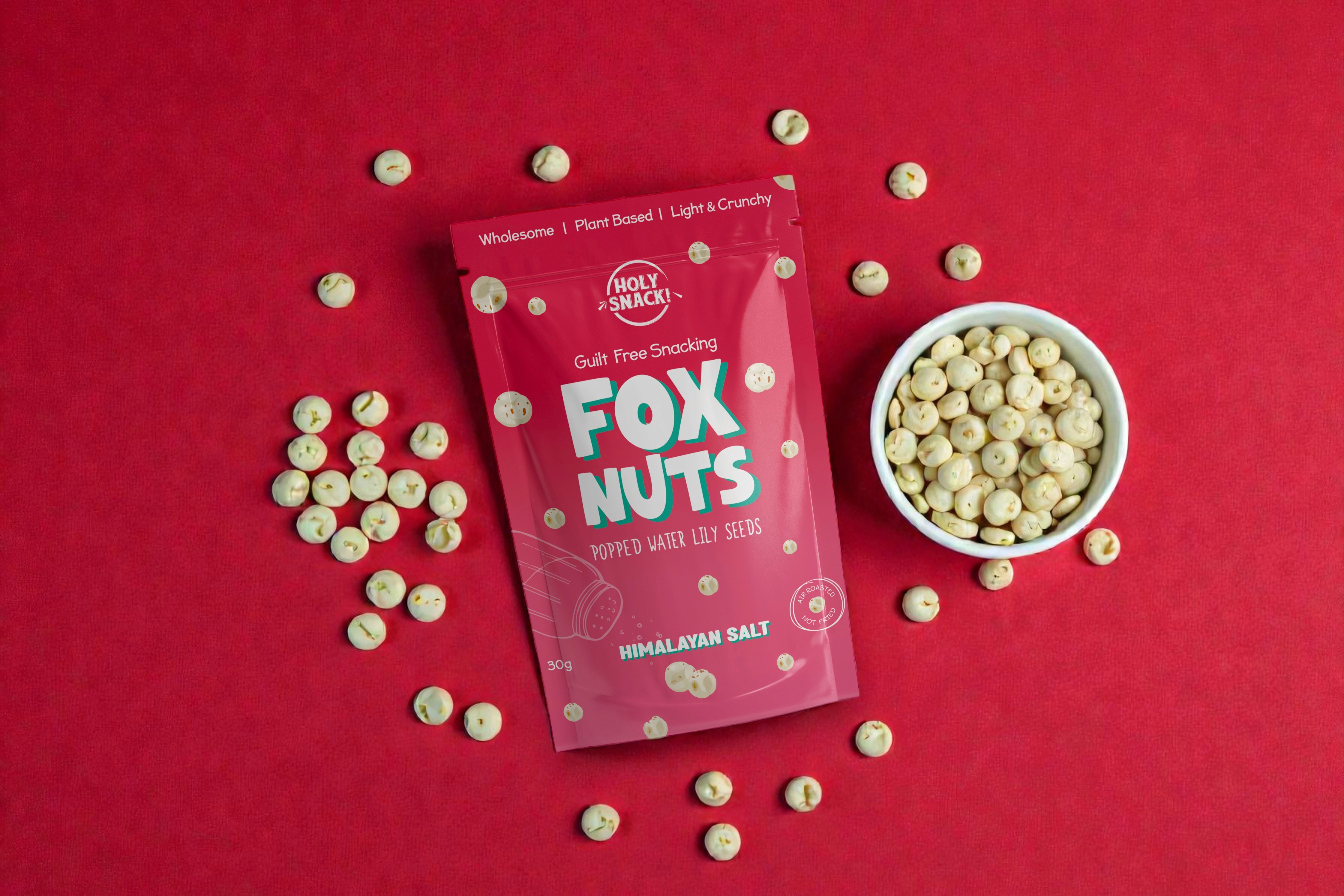
I had the opportunity to work with Holy Snack on the brand identity and packaging design for Fox Nuts, a new snack range made from popped water lily seeds. The aim was to create packaging that felt bold and eye-catching on shelf, while still remaining tasteful and considered.
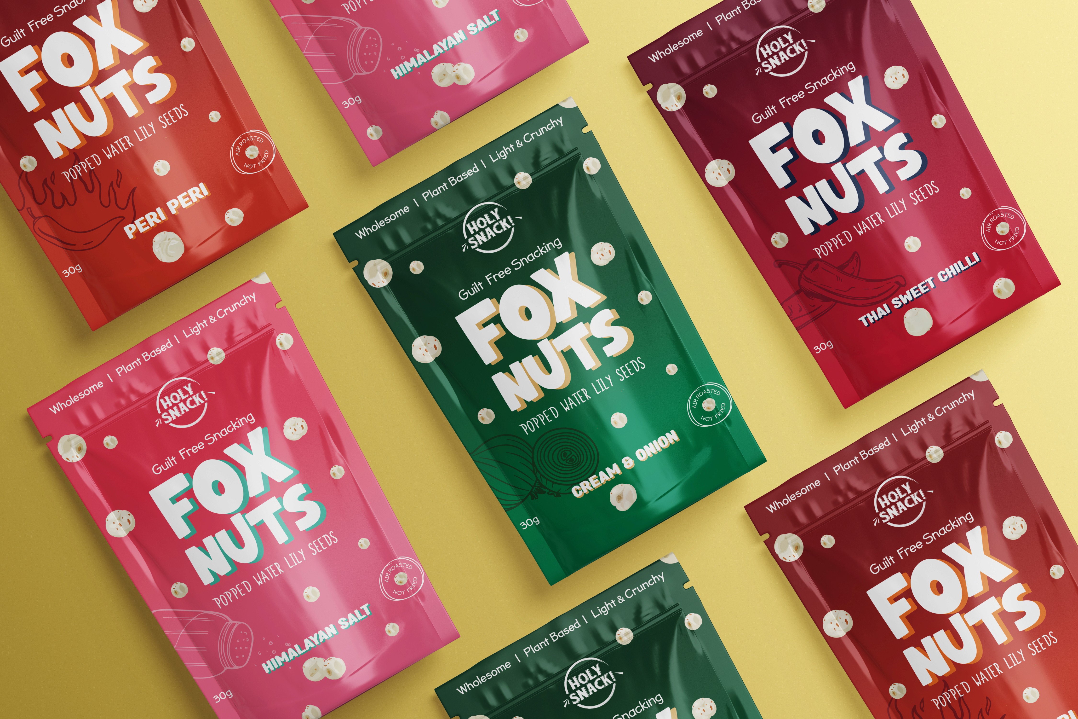
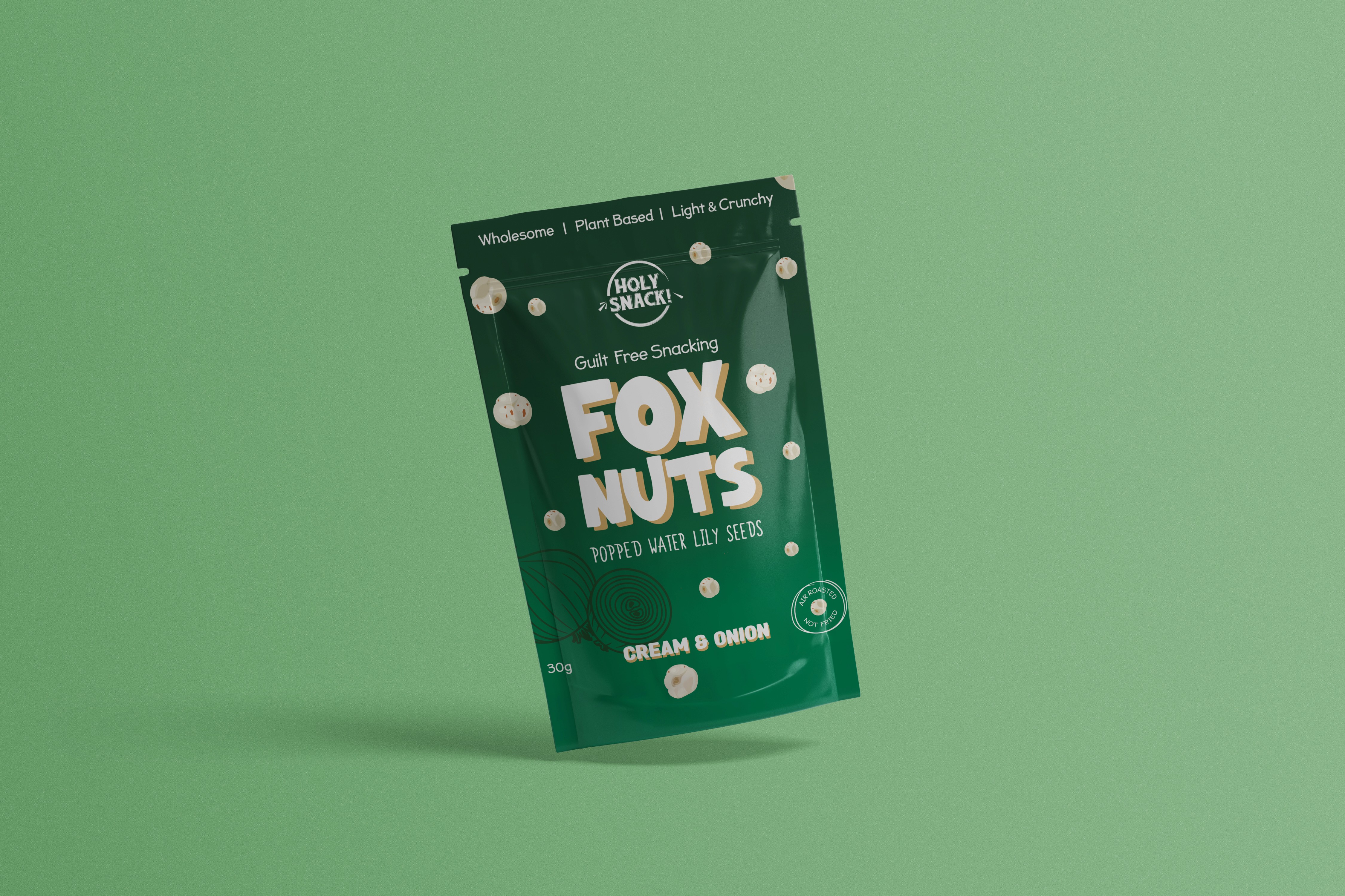


The brief was simple but intentional. The range needed to stand out in a crowded snack category without feeling loud or gimmicky. Colour played a key role in achieving this, with a vibrant yet balanced colour palette developed across the four flavours. Each colour was chosen to clearly differentiate the flavours while still working together as a cohesive range.
From identity through to final packaging, the focus was on creating something distinctive, approachable, and confident. The finished result is something both the Holy Snack team and I are incredibly proud of, and a project that was genuinely rewarding to bring to life.
other projects

This & That - Brand Identity & Packaging
Packaging Design
This & That - Brand Identity & Packaging
Packaging Design
This & That - Brand Identity & Packaging
Packaging Design
This & That - Brand Identity & Packaging
Packaging Design
This & That - Brand Identity & Packaging
Packaging Design

STEDI Australia - Digital Campaigns
Digital Campaigns
STEDI Australia - Digital Campaigns
Digital Campaigns
STEDI Australia - Digital Campaigns
Digital Campaigns
STEDI Australia - Digital Campaigns
Digital Campaigns
STEDI Australia - Digital Campaigns
Digital Campaigns

RUNVA Australia - Product & Packaging Design
Product & Packaging Design
RUNVA Australia - Product & Packaging Design
Product & Packaging Design
RUNVA Australia - Product & Packaging Design
Product & Packaging Design
RUNVA Australia - Product & Packaging Design
Product & Packaging Design
RUNVA Australia - Product & Packaging Design
Product & Packaging Design