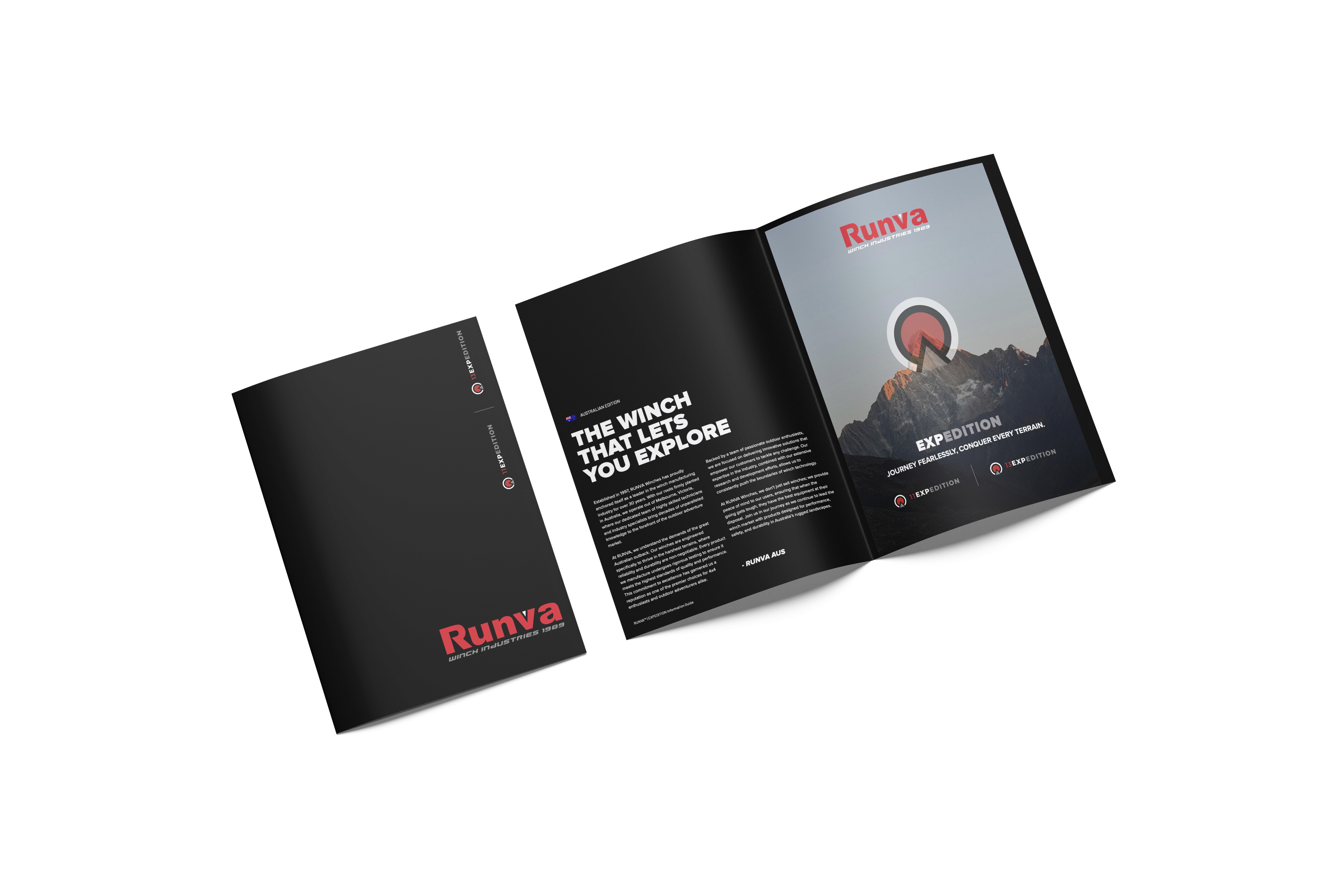
RUNVA Australia - Technical Documentation Design

RUNVA Australia - Technical Documentation Design

RUNVA Australia - Technical Documentation Design

RUNVA Australia - Technical Documentation Design

Pastel ice cream packaging design with retro typography on pink background

project overview

The technical documentation design for RUNVA was an ongoing project that played an important role in shaping how the brand communicated across technical, B2B, and customer-facing touchpoints. When I began working with RUNVA, the brand already had an established logo and colour palette. The challenge was not redefining the brand, but creating a clear, consistent layout system that could be applied across a wide range of formats and uses.

project type

technical documentation design

year

2023

my role

Lead Designer

Hand holding waffle cone with three scoops of colorful pastel ice cream
Close-up of hand holding pink ice cream cone against pastel background

The system needed to work seamlessly across multiple mediums, including exhibition and trade show flyers, user manuals, product guides, and internal or B2B documentation such as capability statements. With such varied content, the focus was on strong structure, clear hierarchy, and flexibility, allowing information-heavy documents to remain easy to navigate and visually cohesive.

The final designs adopted a clean, minimalist approach, utilising RUNVA’s red, black, and grey colour palette and making intentional use of negative space. This approach improved clarity, readability, and consistency, while reinforcing RUNVA’s technical and professional brand presence across all documentation.